Basic Web Design Principles
Basic Web Design Principles
"Balance between visual elements, consistency in layout, use of negative space, appropriate color scheme, and easy navigation."
Did you know 94% of first impressions about a website are about its design? That's right - how your web pages look can really affect how users feel. I'm excited to share some key principles to help you make your website stand out.
Web design is more than just making things look good. It's about making sure your site is both pretty and works well. Every design choice, from layout to color, affects how people use your site. Let's look at the basic online design principles that can change your online look.
In this guide, I'll show you the basics of making a great website. We'll talk about understanding what users want and mixing looks with function. By learning these principles, you'll be ready to make web pages that look amazing and work well.
Key Takeaways
First impressions of websites are largely based on design
Web design balances visual appeal with functionality
User experience is central to effective website design
Every design element impacts how users interact with a site
Mastering basic principles leads to creating exceptional web pages
Understanding the Fundamentals of Website Design
When I make a website, I think about what users want. This makes sure visitors have a good time. A great website builder lets me mix looks with working well.
The importance of user-centered design
User-centered design is key for a website to do well. I think about how people will use each page. This means making things easy to find and use.
Balancing aesthetics and functionality
A website that looks good also needs to work well. I pick templates that are pretty but don't slow down the site. The right typeface and colors make it easy to read and still look nice.
Key elements of effective web design
Good online design has a few important parts:
Clear layout that guides users
Consistent branding across all pages
Fast loading times for better user experience
Mobile-friendly design for all devices
By focusing on these basics, I make websites that look good and work great. The right tools help me do this, making a site that really meets its goals.
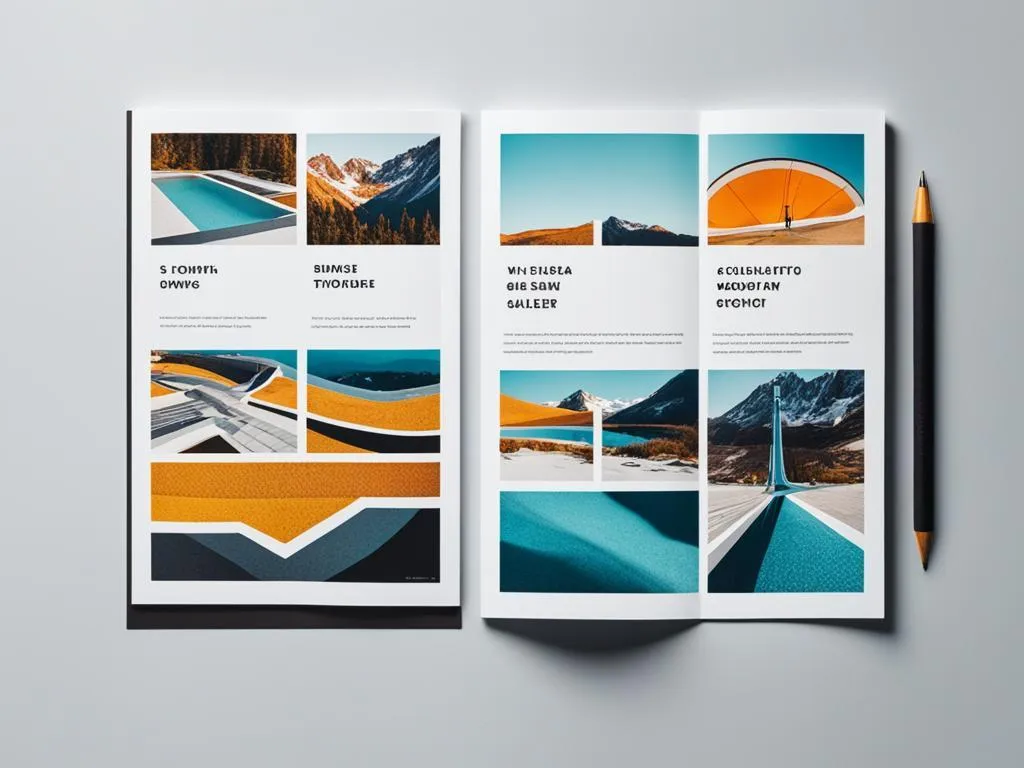
Layout and Visual Hierarchy in Web Design
Learning about layout and visual hierarchy is crucial for making great websites. I make sure to guide the user's eye across the page when I design your site. This makes it easy for visitors to find what they need, making their visit better.
Visual hierarchy is very important in online design. I arrange elements in a way that highlights key content. This makes it easy for users to move through the page. It also makes them more engaged and understand better.
A well-structured layout makes a big difference in a website's look. I use many techniques to make this happen:
Consistent spacing between elements
Grouping related items together
Using contrasting sizes for different levels of importance
Implementing a grid system for alignment
A clear visual hierarchy helps with the page's content too. I arrange information so key messages stand out. This makes reading easier and helps users remember important info.
Color Theory and Its Impact on User Experience
Color theory is very important in making user interfaces. The right colors can make a website more engaging. Let's see how colors grab visitors' attention and help with brand presence.
Choosing the right color palette for your brand
Choosing colors that fit your brand is crucial. Start with your logo colors and add more from there. A matching palette helps people recognize your brand and looks better.
Using color to guide user attention
Colors can lead visitors to what's important. I use different colors for call-to-action buttons to stand out. Small color changes help organize your content for easy reading.
Accessibility considerations in color selection
Accessibility is a must for websites today. I make sure the colors are easy to read. Tools like color contrast checkers help me make sure text is clear on all backgrounds. This helps users with vision problems.
Using color theory, I make websites that look good and are easy to use. They also help strengthen your brand.
Typography: Selecting and Pairing Fonts for Readability
"Create an image showcasing various typeface styles and pairings for online design. Use contrasting colors to highlight the differences between each pairing and experiment with different font sizes to emphasize readability. Consider incorporating website design elements such as buttons or navigation bars to show how the typeface would look in context."
Typography is key in making a website look good and easy to read. Choosing the right fonts and pairing them well is very important. Let's look at some tips to make your website better to read and look at.
Font size matters a lot for reading. I suggest using a base font size of 16px for main text. This size is good for most people to read on different devices. For headings, I use bigger sizes to make it clear what's important.
I look at both serif and sans-serif fonts when picking fonts. Serif fonts have small lines and can make headings look fancy. Sans-serif typeface are better for reading on screens because they're clearer. Here's a list of popular fonts:
I like to mix a serif typeface for headings with a sans-serif font for main text. This mix looks good and is easy to read. It's important to use only 2-3 font families to keep your design looking good and professional.
Line spacing and paragraph length are also important. I use a line height of 1.5 times the typeface size to make text easy to read. Short paragraphs of 3-4 lines make content easier to read.
By focusing on these typography tips, you can make your website look great and be easy to read.
Responsive Design: Ensuring Compatibility Across Devices
In today's world, making websites work well on all devices is key. HTML5 and CSS3 are great for making layouts that change size easily.
Mobile-first Design Approach
Starting with mobile layouts is a good idea. It makes sure content is easy to read on small screens. Most web traffic comes from mobile devices.
Flexible Grids and Layouts
Flexible grids make layouts that change size with the screen. I like using percentages for widths. This lets content move smoothly across devices.
Media Queries and Breakpoints
Media queries in CSS3 let us change styles based on device type. Setting breakpoints makes layouts work well on phones, tablets, and computers.
Using these responsive design methods, we make websites work great on all devices. This makes users happier and more engaged.
Website Design: Principles for Creating User-Friendly Interfaces
Design an interface that is easy to navigate and intuitive for users, with clear and concise labeling of buttons and menus. Use a color scheme that is pleasing to the eye and doesn't overwhelm the user. Incorporate white space to make the design visually balanced and not cluttered. Make sure all important information is easily accessible and prominently displayed. Consider incorporating images or icons to help convey meaning without relying on text.
Making websites easy to use is key for a great experience. We focus on design that's easy to understand. This makes users happy and more likely to stick around.
Drag-and-drop makes websites easier to use. It lets users move things around without a hassle. This makes things like changing layouts or uploading files easy.
Letting users change things on their own makes the site feel more like their own. They can pick colors, move things around, or choose what they see.
Animations can make websites more fun and engaging. They can show where to click or highlight important stuff. But, too many animations can be annoying.
We aim to make websites that feel natural and easy to use. By using these design tips, we can make sites that look good and work well.
Incorporating Effective Navigation and Site Structure
Good site navigation is key to user engagement. I always prioritize creating a structure that helps visitors find their way around easily. Let's dive into some tips for making your site navigation user-friendly and effective.
Intuitive Menu Design
A well-designed menu is crucial for smooth site navigation. I keep menus simple and logical, using clear labels that match user expectations. Dropdown menus work great for organizing lots of content without cluttering the main navigation.
Clear Information Architecture
Good information architecture makes it easy for visitors to find what they need. I organize content into logical categories and use descriptive labels. This helps users understand where they are and where they can go on the site.
Breadcrumbs and Secondary Navigation
Breadcrumbs show users their path through the site, making it easy to backtrack. Secondary navigation, like sidebars or footer menus, gives users more ways to explore. These elements boost user engagement by providing multiple navigation options.
Remember, good navigation design puts user needs first. By making it easy for visitors to find their way around, you'll create a more engaging and user-friendly website.
Optimizing Website Performance and Loading Speed
A fast website keeps visitors happy. Quick loading times help increase website traffic and boost search engine rankings. To speed things up, I compress images and use caching. These simple steps make a big difference in website performance.
Picking the right web hosting is key. A good host keeps your site up and running smoothly, even with lots of visitors. I always look for hosts with solid uptime records and fast servers. This helps me avoid slow loading times that can drive people away.
Search engine optimization goes hand in hand with speed. I focus on creating clean code and optimizing content. This helps search engines understand my site better. The result? Better rankings and more organic traffic. Remember, a fast, well-optimized site is a win for both users and search engines.
FAQ
What are the key elements of effective web design?
Good online design is all about looks and working well together. It focuses on making things easy for users, clear to see, and fast to use. It also makes sure your site looks great on all devices.
How can I choose the right color palette for my website?
Pick colors that fit your brand and the feelings you want visitors to feel. Use colors to draw attention and make sure everyone can see your site well. Today's sites often use colors that match their brand for a nice look.
Why is typography important in web design?
Typography makes your site easy to read and look good. Choose fonts that work well together and follow rules for size and spacing. Good typography makes your site look professional and easy to use.
How can I ensure my website is compatible across devices?
Use responsive design to make your site work on all screens. This means using flexible grids and special coding for different devices. HTML5 and CSS3 help your site adjust to any screen size.
What are some principles for creating user-friendly interfaces?
Make your site easy to use and fun. Add features like drag-and-drop and customization to keep visitors interested. Your goal is to make your site feel natural and enjoyable.
How can I optimize my website's performance and loading speed?
Make your site load faster by optimizing images and reducing code size. Use caching and choose a good hosting plan. Fast sites are better for users and help with search rankings.
